Improving membership engagement
Currently, over 70% of the Miles user base is in the highest tier, Platinum. Our team at Miles believes that obtaining the highest tier this easily will lead to disengagement and increase user churn.
Therefore, we decided to use this chance to revamp our membership program to make it more challenging so that users can earn hard, reap the benefits harder.
How do we engage users with the new membership experience?
Core Team
Product Designer (me)
Product Manager
Engineers
Graphic Designer
Timeline
3 months
Some time in 2022
Scope
Information Architecture
Interaction Design
Visual Design
Research
In this new membership experience, users are encouraged to spend and earn more miles by showcasing membership perks front and center, allowing easy access to claiming the rewards, and providing clear pathways of making progress to the next tier!
Success Metrics
• 50% of the users fall in the intended tier user base
• 20% monthly increase of miles spent
• 20% increase in the number of trips taken
I started the project by conducting preliminary research with the internal team and found…
🙅♀️ Unfamiliarity with the Home screen (where membership status is located)
🙅♀️ No one sees the relationship between higher status and better benefits
🙅♀️ There is a lack of personal achievements or progress
To these users, the lack of discovery and curiosity for the rest of the app besides the Rewards screen prevents them from wanting to explore the full functionality of what they can do with their mileage.
Since we already have the new rules and benefits, we now need to understand how to implement them in a way that makes sense to the users
Step 01: Revamping the structure
From the survey sent out, most participants believe the most important features are as followed:
In addition, after interviewing some internal users, their needs can be summarized as:
Challenge: Conflicting User Needs and Product Goals
Card Sorting
I implemented a quick and efficient way for card sorting using Figma Jam. This allowed the participants to freely move the cards around to help me understand what is their priority when it comes to possible features for this project.
Interestingly enough, most users ranked terms relating to rewards and benefits the highest, followed by the visual appeal and user information, which to some also includes membership status.
However, this means that to these participants, membership status only comes after benefits and rewards, the complete opposite of the product goal.
The solution?
Provide easy access to both current and following membership tier(s) that highlight exclusivity in addition to showcasing the user’s current membership status along with their progress
Information Architecture
Based on the information above, I created a new structure prioritizing the user's membership progress status, their available mile balance, and personalized features.
Step 02: Testing the waters - home screen
After having some initial understanding of how users interact with the existing product and the stakeholder's view on the new tier membership, I then created some very high-level wireframes based upon this knowledge to test with more internal team members and get their first reactions.
Concept A
Highlight the user’s progress and map it with the app’s main features
Pros
Intuitive grouping mechanism
Effective screen estate usage
Clear progress bar reading
Cons
Wordy top section
Does not convey an “or” statement
Possible option paralysis
Concept B
One view for each of the different progress bars plus shortcuts highlighting the main features.
Pros
Intuitive grouping mechanism
Focus on one progress bar at a time
Effective feature discovery
Cons
A lot of information present
Lack of discovery for other progress bars
Concept C
Highlight the user’s progress and map it with the app’s main features
Pros
Simple progress understanding
Effective screen estate usage
Prompts the user to take action and entices more interactions with the benefits
Cons
Does not convey an “or” statement
“Benefits” taking up too much of the rest of the screen
Since we want to prioritize the user seeing their progress, we decided to go with the option that includes visibility on both progress bars.
In addition, we also provided easy shortcuts for users to explore our rewards, challenges, raffles, donations, and many more, as these are our main features that engages and monetizes for the app.
Wireframe Evolutions
Branding
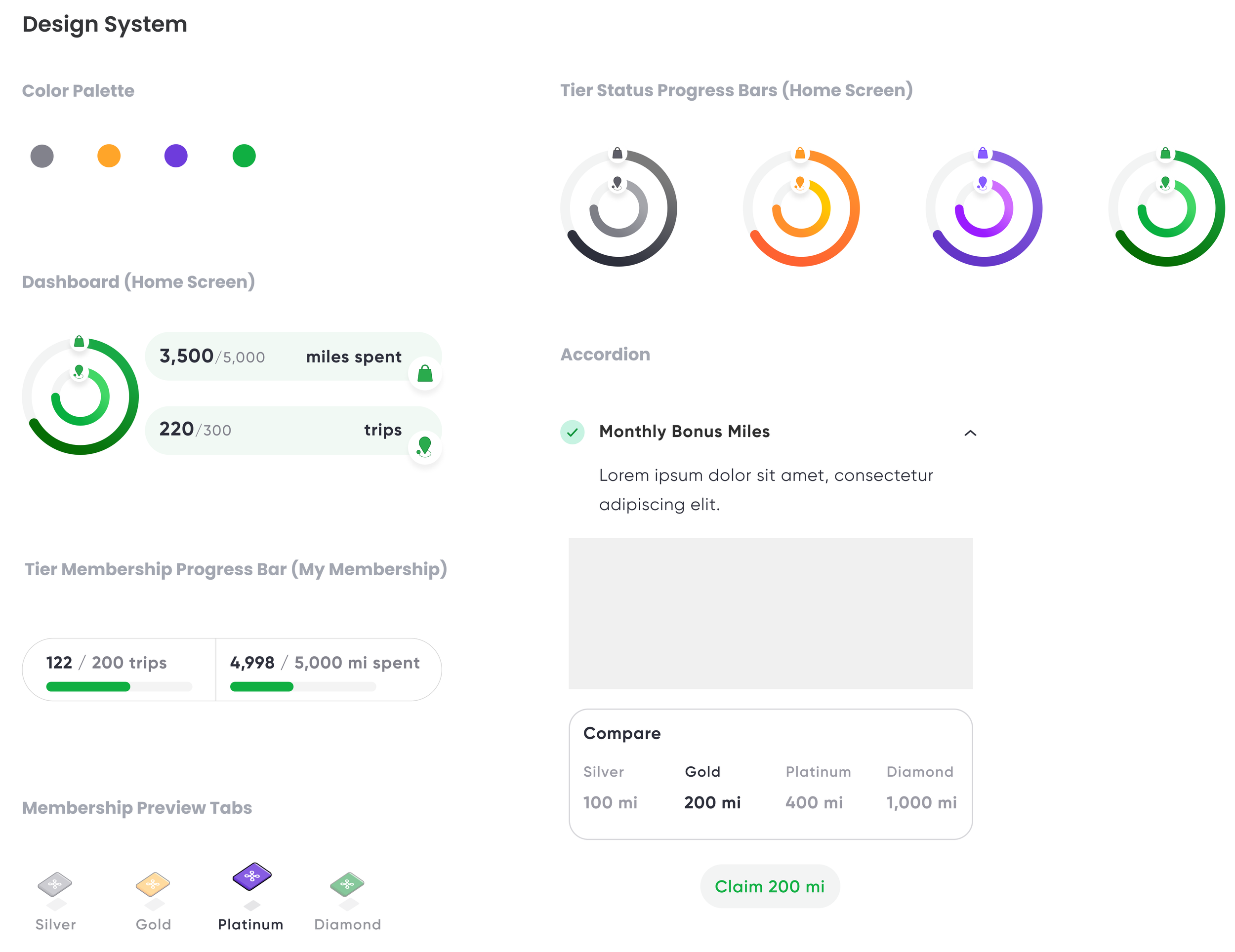
Considering the mission of Miles and its features, I wanted to create a fun yet clean UI for the users to enjoy.
Some ideas sprouted from looking at apps such as Uber, Trip Advisor, and Duolingo.
Hand-off Documentations
There were many documents to hand off since many of the new features have rules that did not exist before.
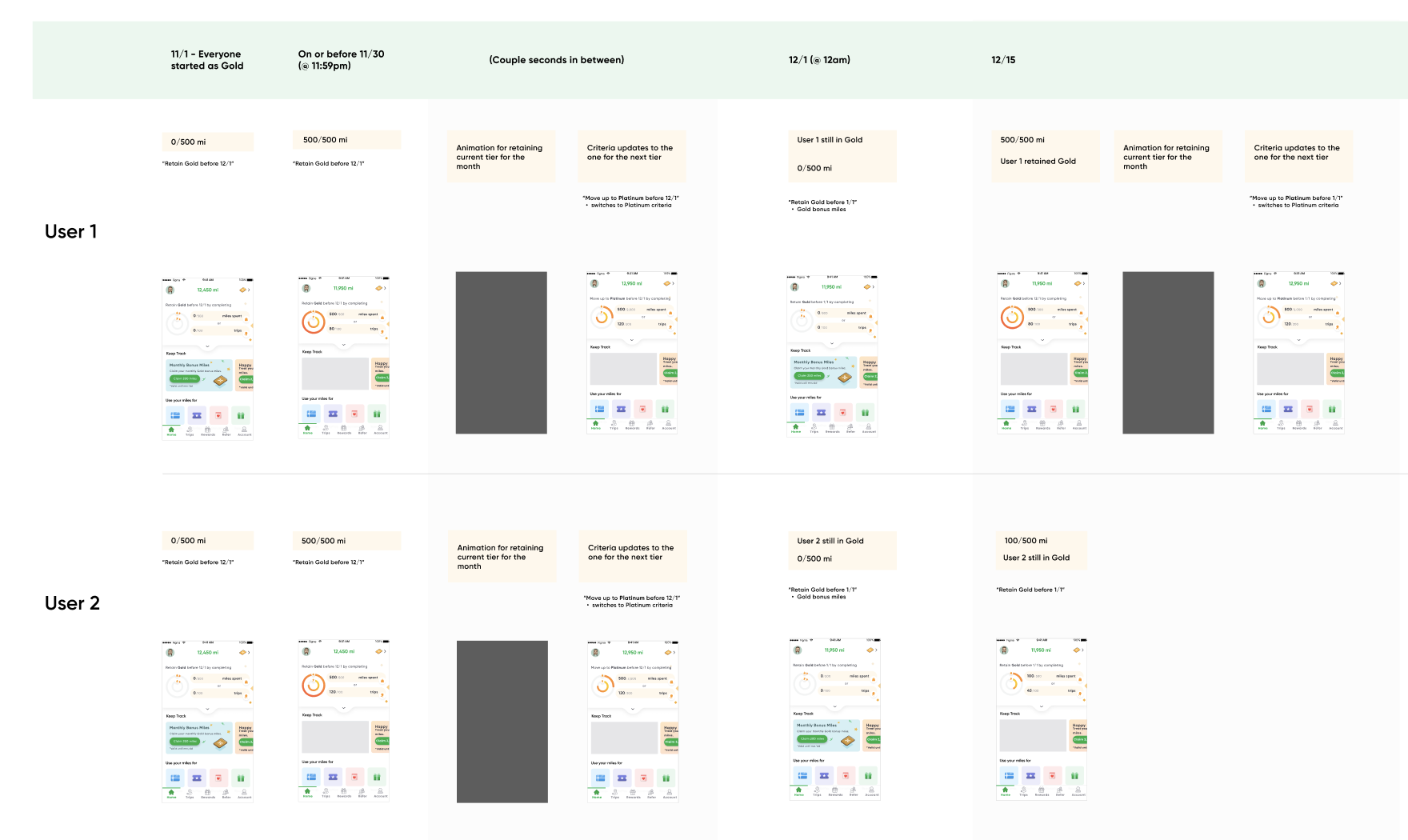
Additionally, with new designers and engineers on the team, and the complexity of earning and moving up a membership status, I documented all the scenarios that a user may be in throughout the months.
Having this type of visual timeline not only helps with clarification during implementation but also allows the team to understand how a user's interaction with our product would be.
See the example below:

The New Membership Experience!
01 Home Dashboard
The Home screen is now personalized for each of the Miles users. They can now easily check their membership status and other activities, with shortcuts to other features to enjoy.
02 Tier Membership
If the Home dashboard is not enough for the power users, they can go to “My Membership” to check their status with more details and get a sneak peek of what they’d get with the next status!
03 Benefits List
To make the most out of the membership page, each benefit gives a detailed explanation of what it is, a comparison chart, and also a call-to-action button for ease of use.
Results
Conclusion & Takeaways
At the start of this project, I did not realize how big of a task this feature would be. Although the main focus really was to redesign the architecture of the app for this new tier membership, a big part of it also rests on creating a more engaging UI that would excite our users to visit the Miles app more often. This meant having to think outside of the box 99% of the time but also aligning it to reality by learning about engineering constraints and budgeting resources.


